Overview
getTalent, a web recruiting tool by Dice, hired me to help evolve their MVP into a cleaner, more scalable product. Built for recruiters, the platform needed UX structure, visual clarity, and a system that could grow with their roadmap.
Key goals:
- Redesign core flows like pipelines, candidate profiles, and filtering
- Reduce complexity across data-heavy views
- Build a flexible component system for future features and dev handoff
Team:
I was the sole product designer, working with a PM and three engineers. I also contributed directly to production CSS.
Challenges
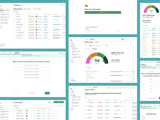
The early interface was cluttered and inconsistent, especially in complex areas like filtering, profile management, and candidate importing. Filtering tools were unintuitive, there was no scalable design structure, and duplicated candidate entries were becoming a frequent issue. At the system level, they lacked consistent loading states, clear IA, and a cohesive component set.
Process
I started by auditing the existing product to identify friction points and areas of inconsistency. From there, I broke the work into core functional areas and tackled them systematically. Each section required close collaboration with engineering to ensure designs could be implemented smoothly. The goal throughout was to simplify complexity, make the interface more intuitive for recruiters, and lay the groundwork for scalable design.
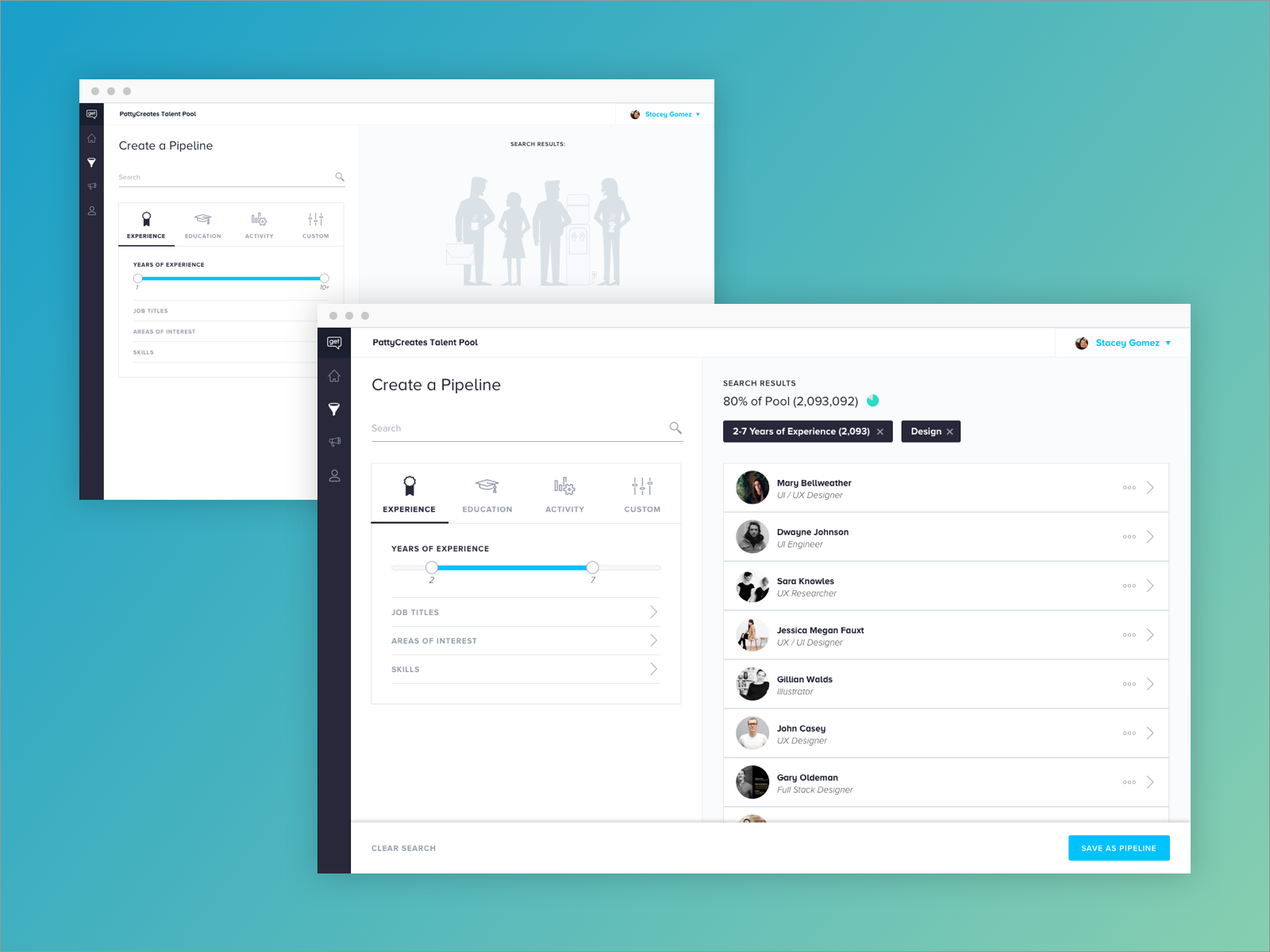
Talent Pipeline
The original talent pipeline filtering tool was bogged down by clunky animations and an overload of ungrouped filter options, making it hard for users to take quick action. I redesigned this flow by categorizing filter facets, cleaning up transitions, and improving clarity across the board. This reduced overwhelm and made filtering faster and more intuitive.
While refining this experience, I also addressed smaller but important details like loading states, blank states, animation behaviors, and form styling—laying the groundwork for a unified component system.


Candidate Profile
The candidate profile had to support a growing number of features—from engagement metrics to resume parsing to CRM-style actions. The original setup wasn’t scalable, so I focused on creating a flexible UI pattern that could grow with the product. This approach allowed the engineering team to continue layering in new functionality without breaking the core layout or design consistency.
MergeHub
getTalent had a sprawling toolset for importing candidates, which often led to duplicated profiles. I started by auditing all the different entry points and designing a better system for detecting and managing duplicates. Instead of building a massive deduplication system up front, we took a lean approach: lightweight alerts would flag potential duplicates and direct users to a new MergeHub interface.
This allowed us to ship faster while still improving the experience around data cleanup and profile management.


Lightweight Design System
To support the redesign and future work, I created a basic Material-based component library in Sketch and helped define brand styling. I contributed production CSS directly in the Angular app, and set up internal systems to support better cross-functional collaboration and consistency across features.

Results
After several UX cycles, I created a small Material-based component, and reviewed and contributed production CSS.
The redesigned experience simplified the product across the board. Recruiters could now filter faster, view candidates more clearly, and clean up data with less friction.
The platform gained a flexible UI system and a foundational design library to support ongoing development. Internally, engineering and design collaboration became faster and more efficient thanks to improved documentation, code quality, and structure.